Struggles of Designing User Interfaces
Hello everyone, lunzyde here!
I'd like to welcome you to another devlog, and this one was briefly mentioned in the first devlog as one of the possible future discussions. It's time to show the different user interfaces that I've design through the development process of the game. This discussion can be updated from time to time in order to add new additions to the designs, I'm still designing the user interfaces so expect some changes.
Update Note (Aug 16, 2021): This devlog is now complete!
Check it out!
Prototype Mock-Up Phase (2014 Era)
Let's start all the way back to the prototype days when the game was originally named "Escape Pixel" as a placeholder.
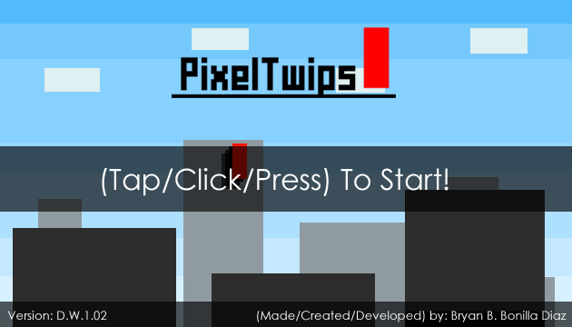
This was the first mock-up ever of the game (made within July 2014), this design was already implemented but some of those selections in the menu were not in-game because they weren't even developed. This served me as a guide on how I wanted the game to be and what to include, I still look at this original mock-up concept for ideas on my designs.

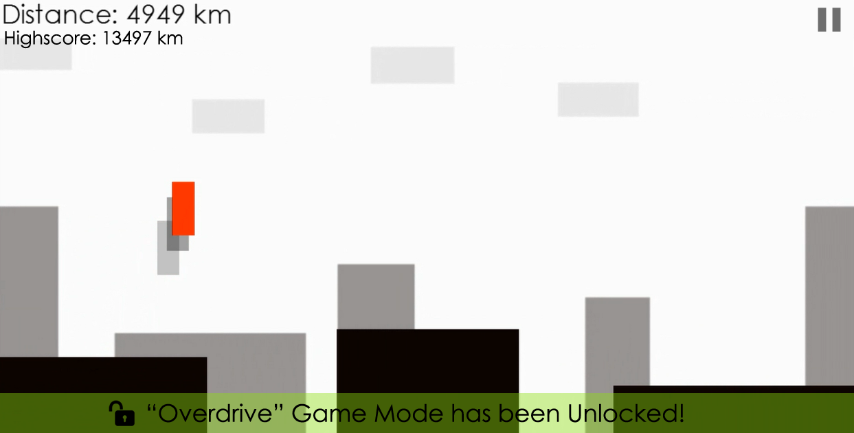
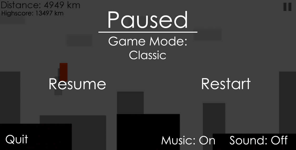
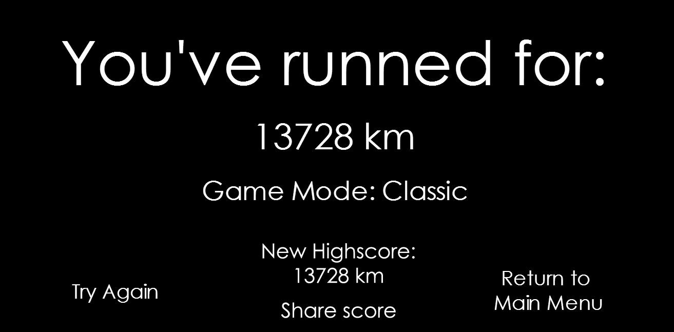
Final Prototype Build (2014 Era)
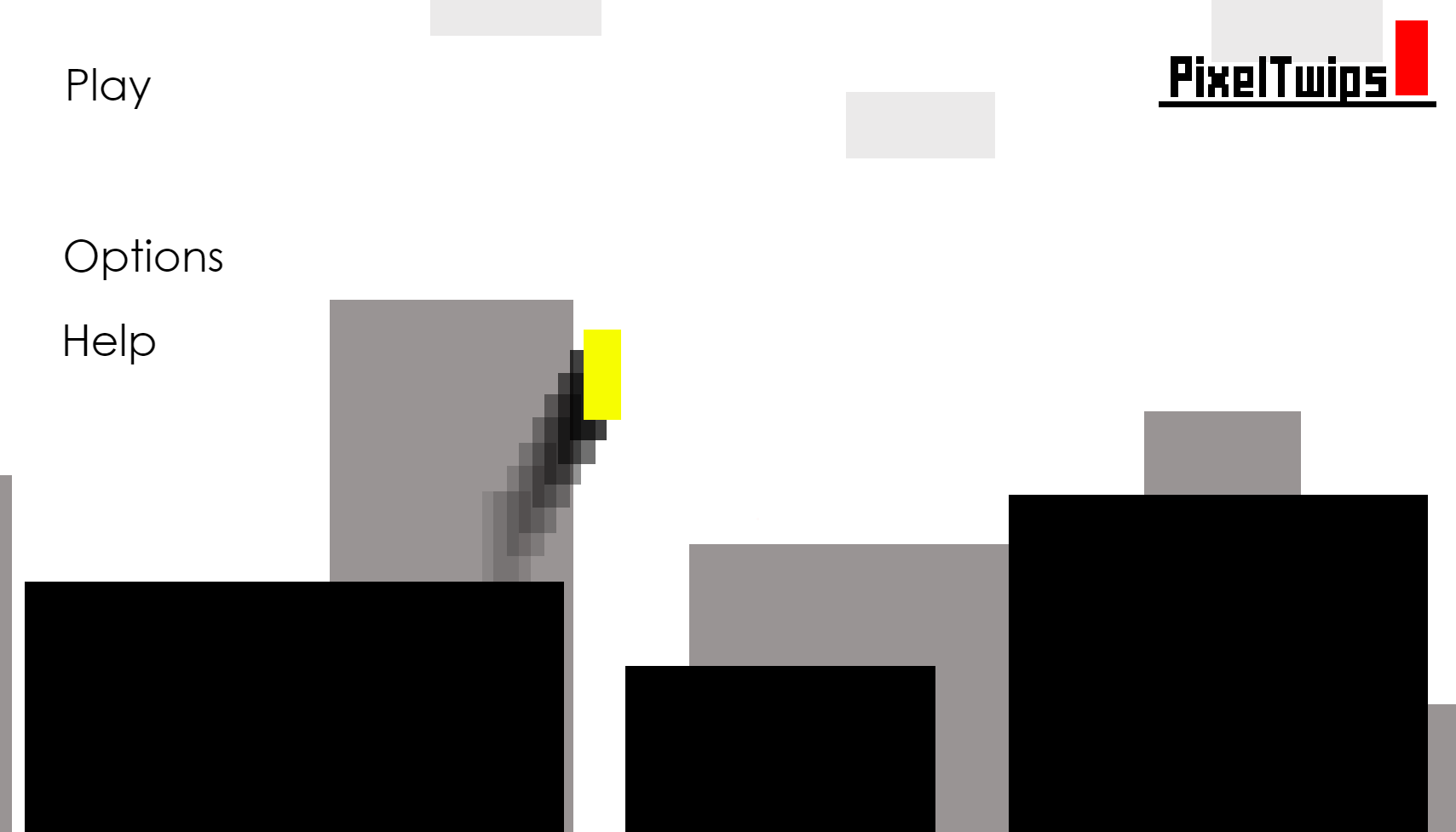
This is the final build of the prototype, as well as the first user interface design showcased at InterActiva Expo 2014, and of course my first showcase at an event. (Note: The build that was showcased was actually the first build of the alpha, but it had the same user interface as the final prototype build.)
Many players understood how to navigate through the menus without a problem as it was mouse-based/touch-based. They could play with a mouse or gamepad in the showcase, but the only inconsistency was that the players couldn't control the menus with the gamepad controller. This was by many the most user-friendly interface, it was very simple to navigate the menus and access the different game modes.
Of course, it's a bare-bones user interface design, but it got the job done!
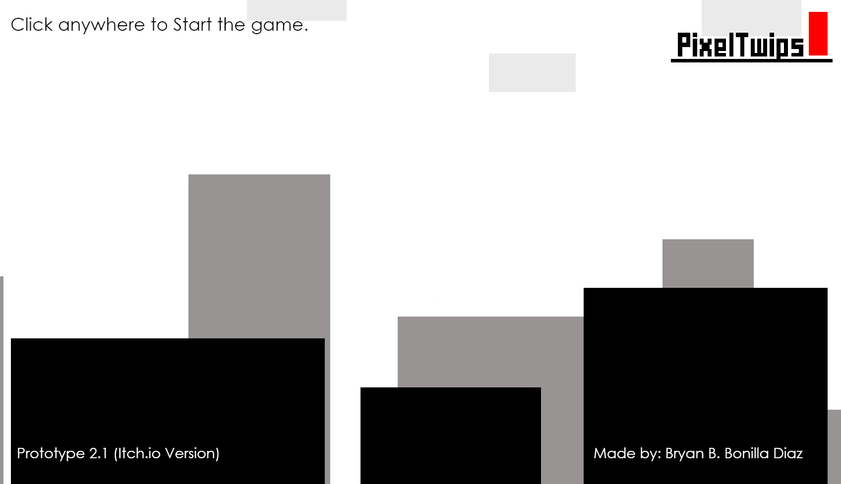

Alpha Mock-Up Phase (2015-2016 Era)
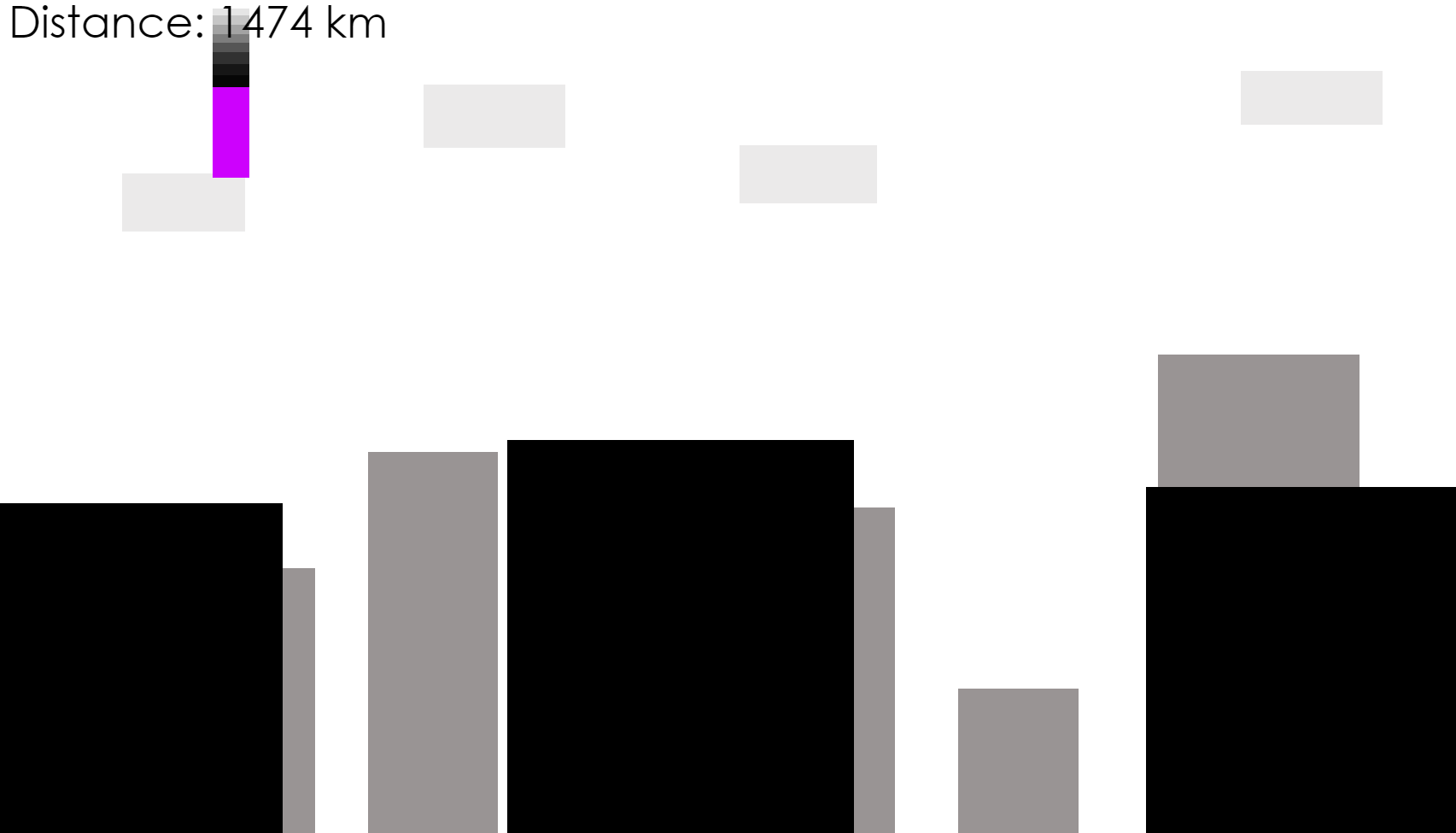
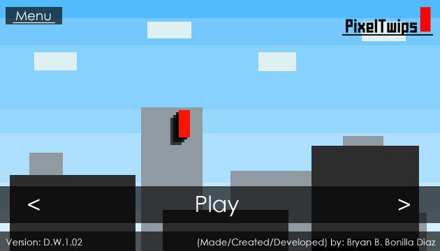
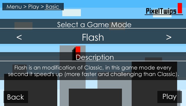
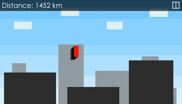
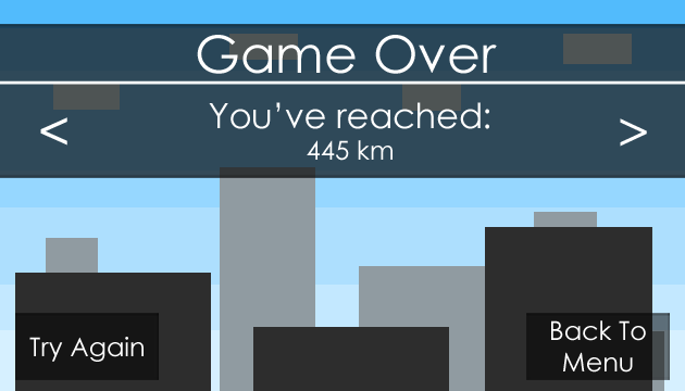
This is where I try to fix the inconsistency the alpha had with the gamepad on the menu navigation, I thought this design would work with three main platform targets (PC, Mobile, Console). The implementation did actually proved to work quite successfully, but the user interface was not ideal nor practical.
Customization was finally added to the game, this was a separate menu, and the feature didn't affect gameplay -it was just purely cosmetic. This meant that you could play any game mode with any combination of customization.
Things didn't look well during this period, as some players needed guidance in order to play.
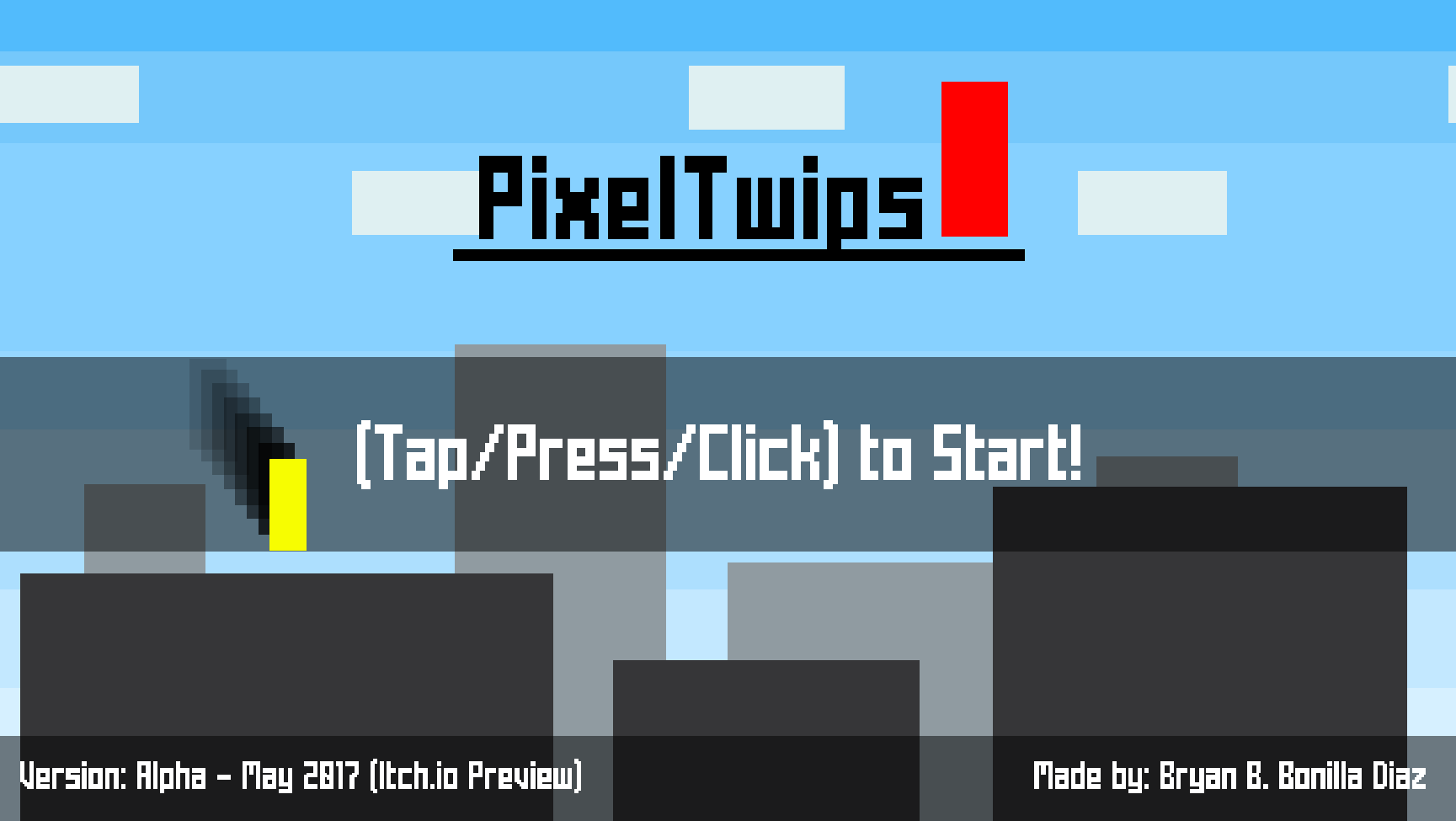
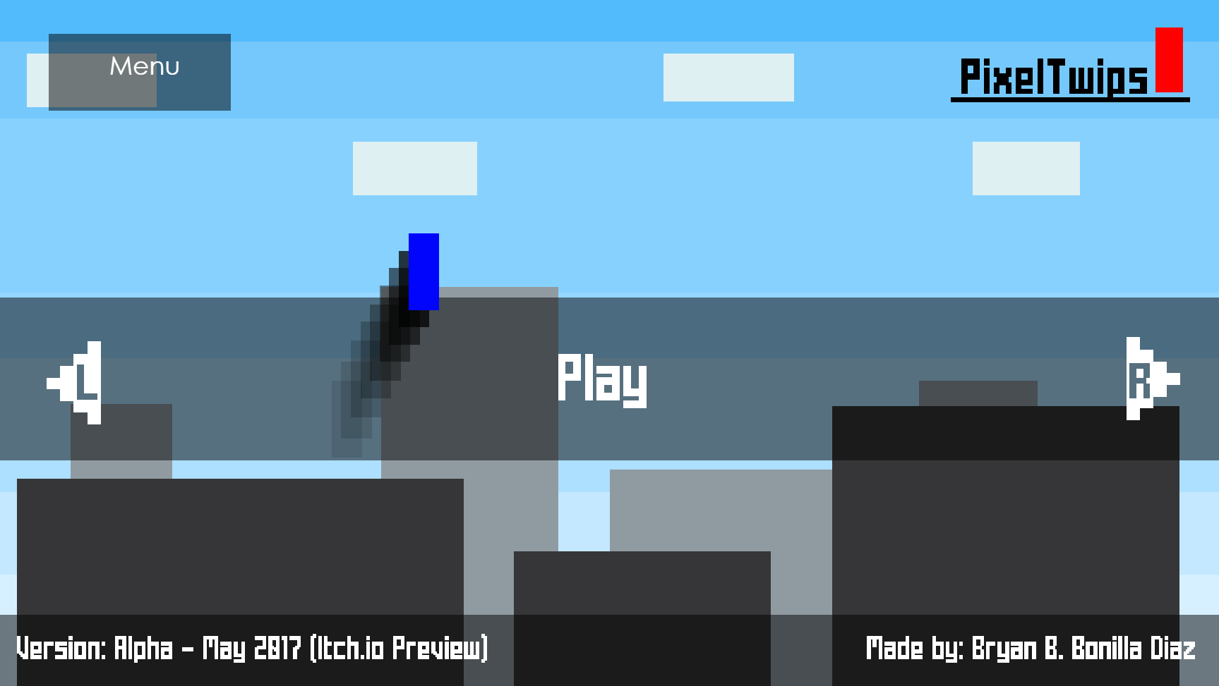
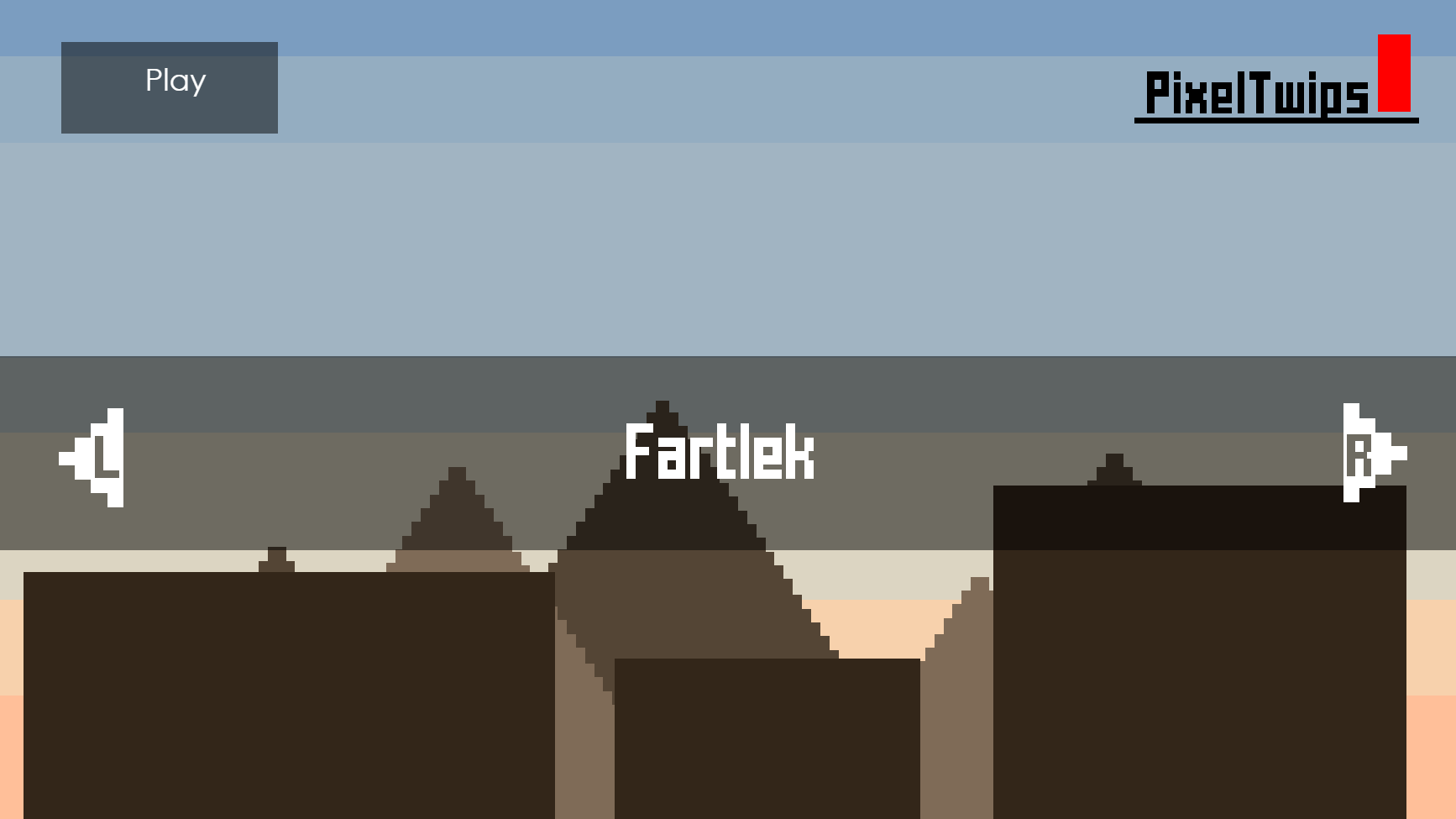
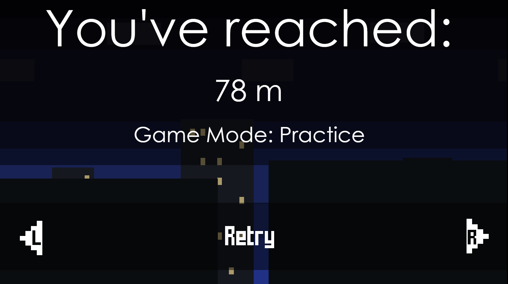
Final Alpha Build (2017 Era)
The most promising build of the game, but its user interface design and players tendencies showed otherwise.
All the menus looked exactly the same, players were left confused with the menu navigation's, many bugs could be attached to the design, players did not use the customization feature, the user interface design itself became a standard of the game as the code is heavily oriented to it, and much more.
During the showcases of the alpha builds, I gathered many complaints of players getting dizzy and feeling sick, I implemented a safety feature to disable most of the flashing imagery within the game. However, this feature even when enabled didn't even properly work at the time, I would still receive complaints from players, thus I had to put a seizure warning within the game.
I like to call this the "troublemaker" build, it introduced so many problems.

Beta 1.0 Mock-Up Phase (2016-2017 Era)
This mock-up phase was entirely skipped due to the outcome of the final alpha build as it was similarly designed. I was trying to improve the design, but it didn't seem to resonate with the players. Some elements from this phase did prevail in the next phase, like the main menu redesign and difficulty meter.
The final alpha build was a huge setback, many things were removed or even disabled. One example was the pause function within the game, the only solution at the time was for the removal of the function. This played a big part in the development hell.
The development process started to slow down drastically during this phase, many players became uninterested before and/or after their first try at the game. Things didn't look well...

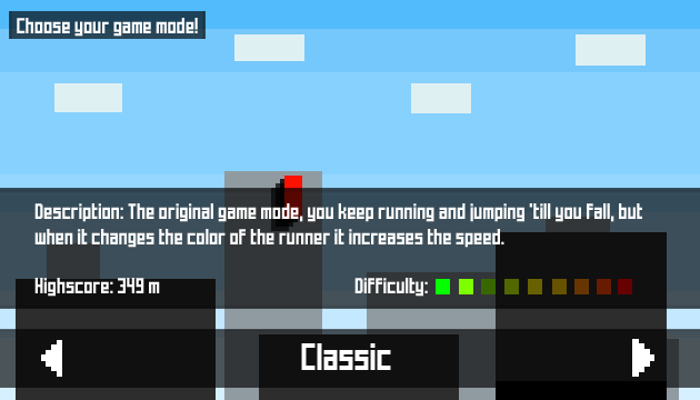
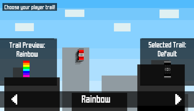

Beta 1.1 Mock-Up Phase (2017 Era)
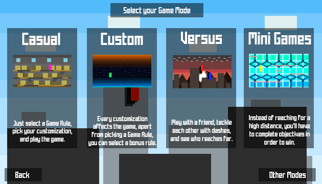
From 2015 to 2017, I still noticed that players didn't care about customization, it simply wasn't important or rather interesting. There had to be a way to force players into customizing their experience, this is when I started developing a new Play Style called "Custom". This encourages players to select different customization in order to spice up their gameplay, it also introduced bonus perks and the difficulty meter.
During this mock-up phase, all the other menus were disabled since the game would be undergoing a major rework. Upon creating Custom Play, this also opened up the idea of Casual Play, Tutorial, and Visualizer.
This phase was a very quick one to implement due to the major rework.
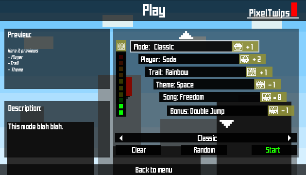

Final Beta 1.1 Build (2017 Era)
For returning players, this was an impressive build. The game looked visually stunning and attractive, even the user interface design rework was appealing for new players alike. The only minor downfall was that the menu navigation on custom play looked complex for players, upon playing for their first time most commonly they requested guidance.
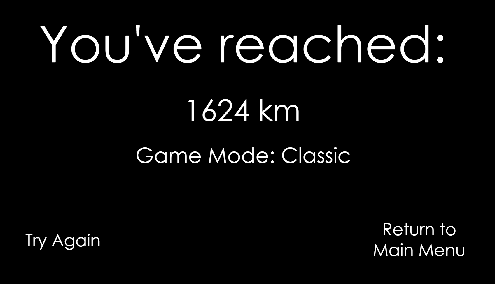
There were a few things left out of this build, one of them was the game over screen rework, it currently has the same user interface design from the final alpha build. Compared to the other final builds, this was the fastest one to develop.
Final Beta 1.2 Build (2018-2019 Era)
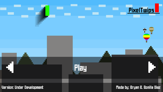
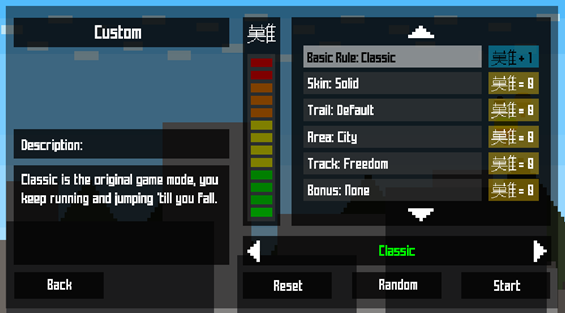
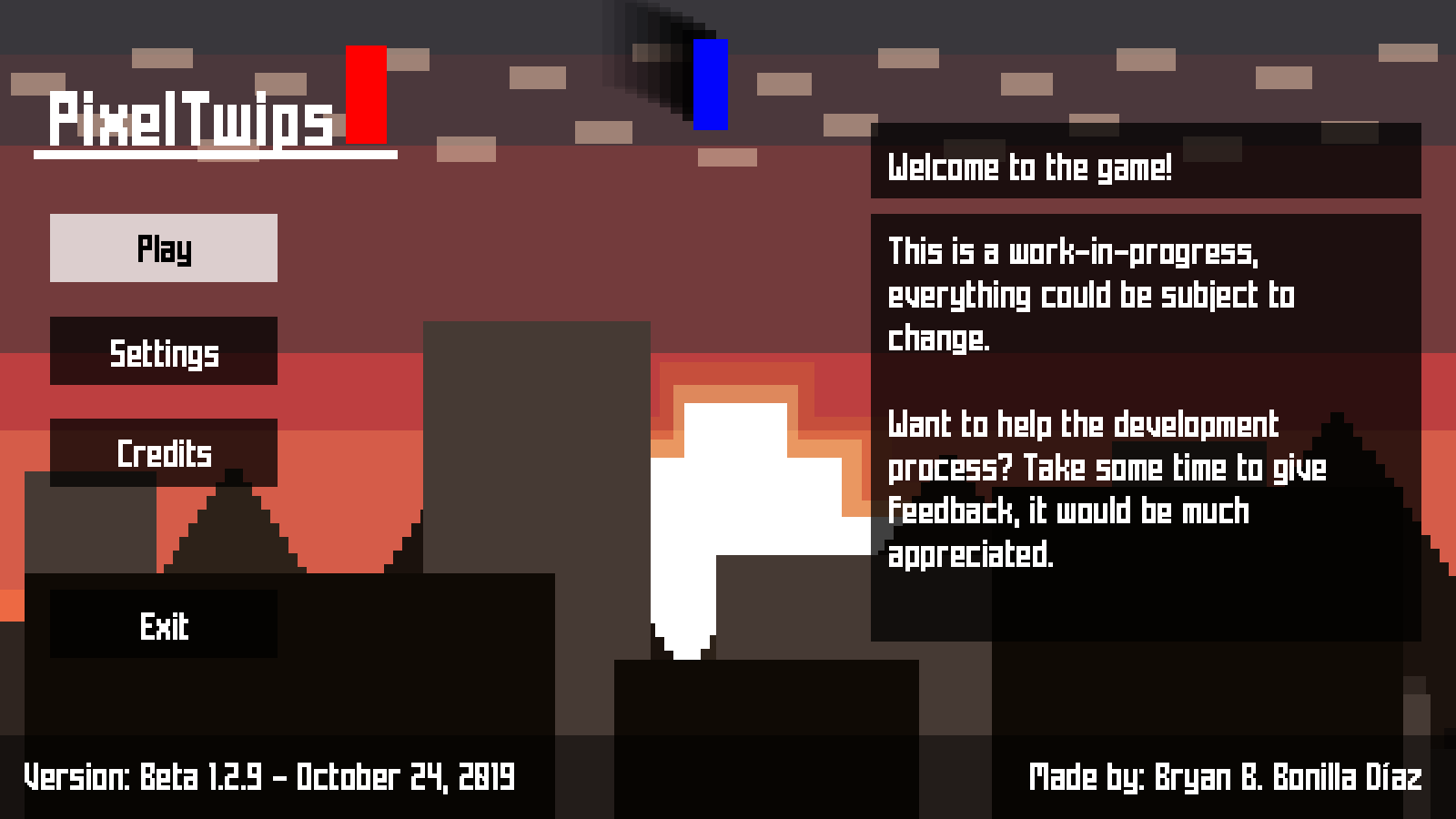
This beta phase established the current user interface design, and its main menu takes inspiration from the prototype builds of the game. Apart from this, the game over menu screen was greatly overhauled to fit the current new design. The only problem with this phase was the menu navigation on every menu, it wasn't properly optimized.
The longest development phase ever, it introduced and reworked many aspects of the game. Surprisingly, this was the last phase to use Construct 2, as the final build was upgraded to Construct 3.

Final Beta 1.3 (2020 - 2021 Era)
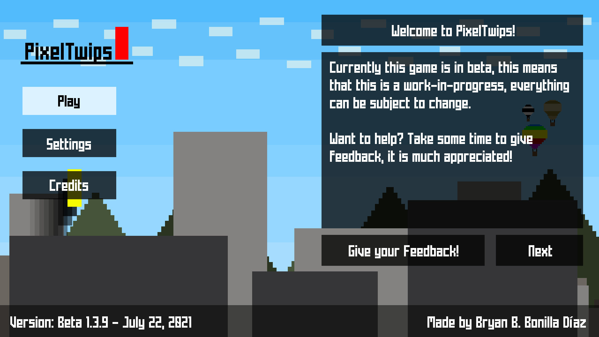
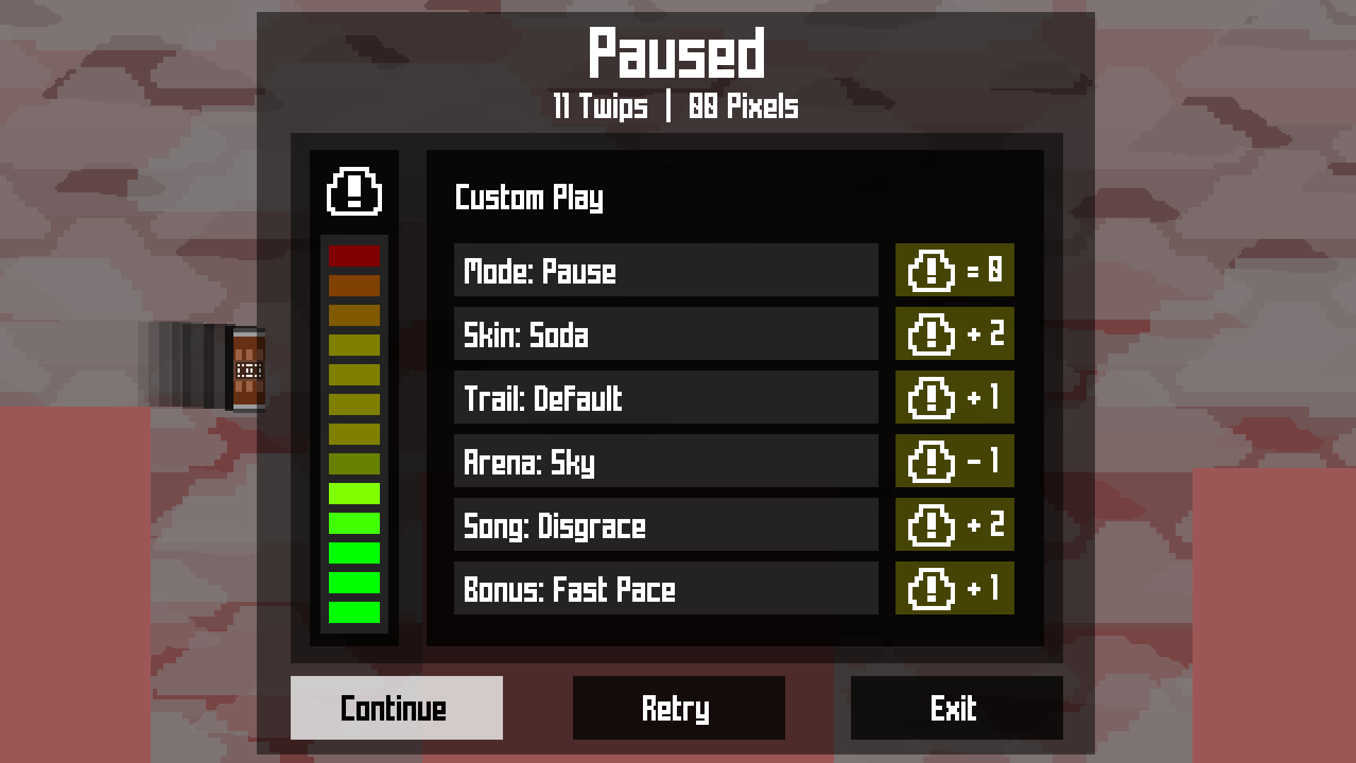
This was the last beta phase for the game that improved, optimized, and finalized the user interface overall. Play menu for players to select a Play Style got implemented, apart from that we have the interfaces for the Paused menu, Visualizer, Setting, and the Credits.
This development phase was the most hectic and drastic out of every other one, it brought so many huge changes and otherwise "canceled" plans back on the drawing board for the beta. This phase on its own is like a completely different development process, it felt brand new.


And that's about it! Thank you for checking out the history behind the development process for the user interface.

Get PixelTwips
PixelTwips
A simplistic endless runner with different ways to play and a variety customization.
| Status | Released |
| Author | Bryan Bonilla Diaz |
| Genre | Platformer |
| Tags | 2D, Arcade, Casual, Endless, infinite-runner, Pixel Art, Retro, Side Scroller |
| Languages | English |
| Accessibility | Interactive tutorial, One button |
More posts
- Version 1.0.6 Update Notes - April 1, 2024Apr 01, 2024
- Version 1.0.5 Update Notes - October 28, 2022Oct 29, 2022
- Version 1.0.4 Update Notes - May 30, 2022May 30, 2022
- Version 1.0.3 Update Notes - March 15, 2022Mar 16, 2022
- Version 1.0.2 Update Notes - January 14, 2022Jan 14, 2022
- Version 1.0.1 Update Notes - October 29, 2021Oct 29, 2021
- PixelTwips featured in the Puerto Rico Games Showcase (2021)!Aug 19, 2021
- Version 1.0.0 is here! Update Notes - August 18, 2021Aug 18, 2021
- PixelTwips Players Guide + Tips & TricksAug 18, 2021
- Beta Update Notes - July 22, 2021Jul 22, 2021
